My picture wall doesn't look quite right: The most common mistakes and how to fix them
The wall print is too small
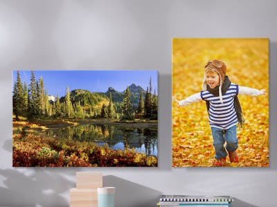
Nah: You have maybe chosen a relatively small print size, for example a Canvas Print in 40x30 cm, for a wall with large empty space. After having mounted the print, you soon recognize that, because of the large bare area, your image is literally drowning and seems insignificant.
Yeah: Hang your picture on a smaller wall surface or combine it with other Wall Prints. Trick the optics and make the free wall area smaller by adding some large potted plants to the area.
The print is far too big for the available space
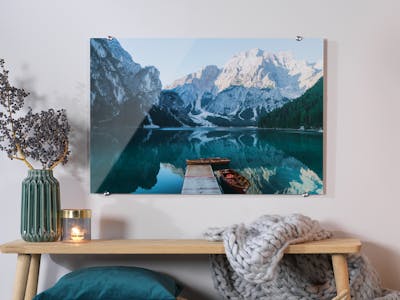
Nah: Ordered a large 120×80 cm Gallery Print and mounted it on a wall that is just 1.30 m wide... The new wall art seems overbearing and oversized and the room itself looks shrunk.
Yeah: Hang your large wall art on a wall surface, where there is sufficient space to the left and the right of the piece. This allows your creation to take full effect. Try moving the print left or right to achieve this effect in the same room. Ordering large prints, make sure a certain viewing distance is available - e.g. hanging a huge Photo Poster right next to the entrance doors means that the photo will never be fully appreciated.
Wild wallpaper patterns
Nah: A simple Photo Poster mounted on a wall that is covered in quite a striking wallpaper pattern. The pattern completely drowns out the photo and it's hardly noticed any more.
Yeah: Add a suitable frame to the wall art. Opt for a poster frame with a wide-width passepartout (also called 'mount'). Thus, the image will stand out against the wallpaper pattern and it will then be perceived as an independent element on the wall. Our Tip: Simply order a Framed Print directly with Pixum if you're lucky to have rented flat with incredible wall paper patterns but still wish to have some prints hanging on walls.
Room height and width haven't been taken into account
Nah: The print size seems to have been rather spontaneous decision. A large print appears tiny mounted on a very narrow wall at the end of a corridor. Or, a narrow-sized print in portrait format seems to have lost its power on a very wide wall.
Yeah: For a wide wall, select a wall image in landscape format, and for a narrow wall go for a picture in portrait format. Images in portrait also have the advantage of emphasizing the height of a room.
Maximise the power of your photos
Creative chaos vs. classical symmetry
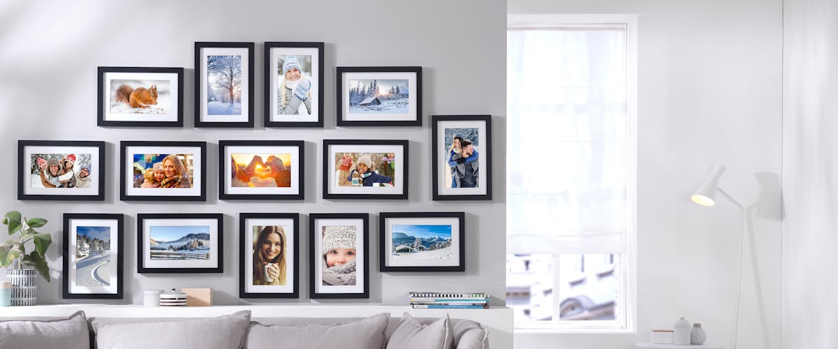
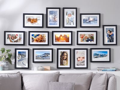
Nah: You've got several randomly arranged prints, and the wall looks chaotic and a bit of an eyesore.
Yeah: Choose a certain type of arrangement (e.g. Petersburg hanging, gallery mountings). Even if this is not straightforward, adding a little system is often sufficient to direct the viewer's focus and allow the overall picture to work harmoniously. Find other tips on arranging your home gallery in the linked article.


