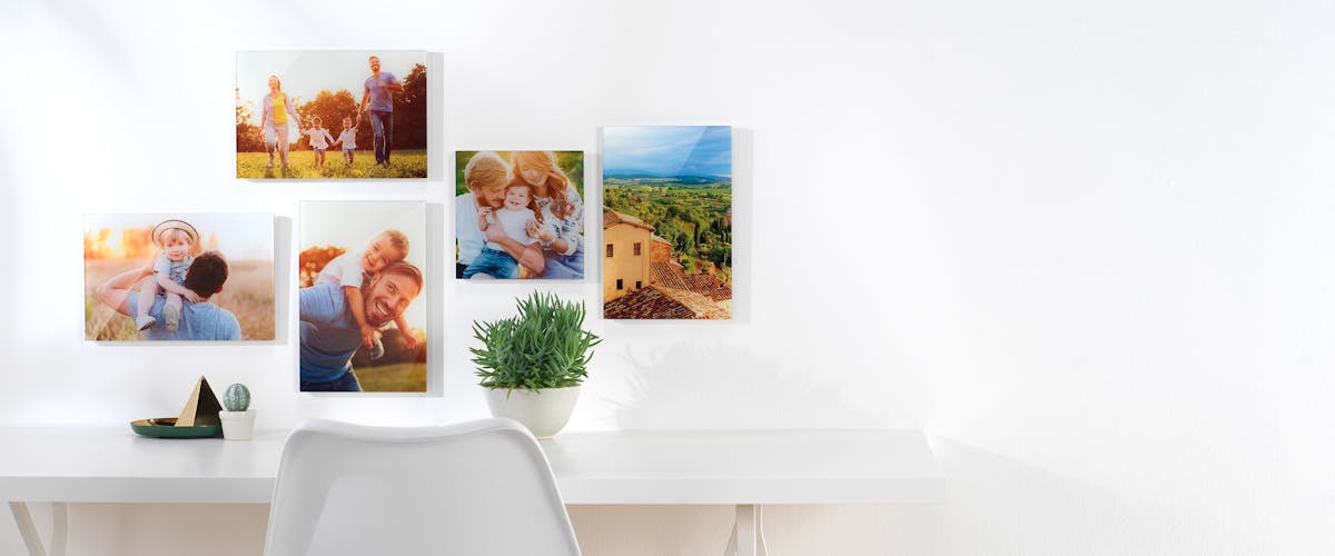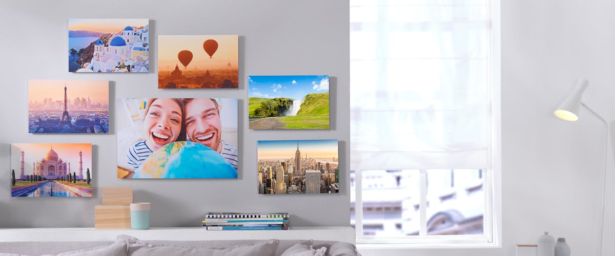
Design your new Wall Art online and read our tips on how to mount the print to get a harmonious gallery wall at home!

Create beautiful picture wall with memories worth printing.
Making a perfect gallery wall with Pixum Wall Art
The height and the position of your new Pixum Wall Art on the wall is not something one can just guess. It rather depends on the size and the shape of the image and, last but not least, the further arrangement of the total room space. It might get tricky if you've got several prints or a huge XXL poster to hang.
Read on to get real-life tips on how to hang posters & co. and enjoy the new look of your unique interior!
| Material | Format | Price | Design directly online |
|---|---|---|---|
| Canvas Print | 40x60 cm | starting at �44,99 | Create a Canvas Print now � |
| Gallery Print | 30x20 cm | starting at �34,99 | To the Gallery Prints � |
| Acrylic Print | 30x20 cm | starting at �23,99 | Create a Acrylic Print now � |
| Forex Print | 40x60 cm | starting at �33,99 | Create a Forex Print now � |
1. Finding the proper height for your wall art
Shall I hang the new prints in the living room, hallway or bedroom? The print position is the best when the photo catches the eye. Generally, the centre of the picture should hang at about eye level, i.e. at a height of about 1.60 m. Your Photo Poster hangs perfectly when one third of the picture is above eye level and two thirds - below it.
In case there are already photos hanging on the wall, use the so-called golden ratio to create a harmonious overall picture. Here is how you calculate golden ratio for your walls:
- measure the ceiling height and mark 5/8 of it up from the floor. Example: ceiling = 2.50 m high. 2.50 � 5 / 8 = mark the imaginary line at 1.56 m height.
- measure the photo print and mark again 5/8 of the image height up from the bottom edge.
- when hanging the print, the mark on the print shall match the mark on the wall. If you've got a framed poster for the living room, also pay attention to the proper position of the mounting set (e.g., screws or clamps).
2. Channeling the mood

Rigid rules are not always useful. Before hammering in a nail or drilling a hole, take a closer look at the whole room, its furniture and the distance between single pieces. If there is a door very close to the new pictures, try to put the upper print border on the same level as the door frame.
Other possible reference points to hand your poster could be, for example, these interior objects:
- fireplace: if you a fireplace in your living room, a print placed centrally above it will add harmony to the room. However, be careful not to hang it too close to the fireplace and thus expose it to direct heat
- cabinet: Framed Print work best when placed above low cupboards and shelves. Either hang the prints in the middle or align them with an outer edge
- window frames: the natural light coming from the window accentuates the colours of the photograph. Be creative when setting the height of the print
- same height as a TV: you might have already set your TV at the perfect height for watching it from the sofa. Do the same with the pictures on the wall and adjust the position of the photo frames to the eye level in a sitting position
Paying attention to the large objects in the room will guarantee you a harmonious look of your personal picture wall.
3. Arranging several prints on the wall

A good idea for an empty wall is a picture wall, arranged with many different prints. Planning is most important in this case - just to make sure your picture wall is a masterpiece with no or little adjustments:
- do the photos have the same size? Then make sure that gap between prints is the same. Prints look best when placed at the same height
- measure it To make sure the gaps are equally large, first lay out the prints on a large sheet of paper and draw the outlines on it. Put this sheet of paper on the wall to easily transfer the points needed for the wall mounting onto the wall itself
- do prints have different sizes? Try several options of positioning before hanging them on the floor. Sew a large sheet of paper (or tuck several pages together) as in the previous tip. Align the prints by the upper edge, arrange them in a square, form a letter or group the pictures by size. The gap between the pictures should always be the same.
- mind the colours: Pictures with lighter tones hang best in the middle, while darker coloured prints look good on the outside of the composition
- start in the middle: Place the first picture in the middle of your composition and add further print to it's left and right. Small mistakes are less important later. Should you start outwardly at a slight slope with several pictures at a time, this will later be clearly visible in the overall picture due to the long row
By the way, you will find detailed instructions for the ideal picture position in our tips!
4. Common compositions for a picture gallery

Think on the overall look of your future picture wall. Here are the well-known (hence time-proven) options:
- art gallery: all prints, regardless of their size, are aligned on the upper edge
- accentuate the size: prints of are hanging from the smallest to the largest one, or the largest print is in the middle and surrounded by the smaller prints as if they were leading the view to the middle piece
- Petersburg hanging: symmetrical arrangement of numerous wall prints or Canvas Prints in different sizes. The whole composition should form a perfect rectangular
- pattern: The hanging pictures form a certain shape, e.g. letters (I or U), a clock or even a staircase
- golden ratio: The prints are placed at a height of 5/8 of the total height of the wall
Sizes & prices
How Much Does My Wall Art Cost?
Use our price calculator to get the best price-performance ratio for your new Wall Art:


